WEB FORMS MIGHT BE BORING,
BUT CATCHING LEADS IS FUN.
approx 4 minute read
Hmmm, you’re right. Web forms are a bit boring. So boring in fact, that we weren’t sure whether we should even write about them.
But making more money is fun, right? Sparking more interest? Generating leads?
OK, good. Because here’s the thing. Despite over 65% of businesses saying that generating leads is really tough, over 70% don’t actually have a call to action on their website. Shock!
CALL TO ACTION, BATMAN
Sounds like a superhero’s inner calling. It’s not. A ‘call to action’ is an attempt to get the website user to do something rather than simply just browse and leave.
These websites are failing. Not pulling their weight. Because if your website isn’t into sales then it needs to be into lead generation.
HOW DO YOU CAPTURE LEADS?
Lead generation falls into two main categories. Let’s call them Real-time and Lifetime.
Real-time lead generation
Real-time leads are gathered immediately. People land on your website and immediately get in touch. This call to action could be by phone, live chat, pigeon.
That ‘in the moment’ stuff is HUGE for businesses right now. Especially when you consider mobile browsing which pulls in location and context (i.e. In your city and looking for a good restaurant right now). Pigeons are less useful in this situation so be sure to have actionable ‘call’ buttons and live chat available.
On mobile, users often prefer an option to call rather than fill out complicated forms on their mobile devices. So offering prominent click-to-call buttons can keep users from ditching the task altogether.
Lifetime lead generation
Lifetime lead generation is about gathering data via a form of some sort. 96% of your website visitors aren’t ready to buy yet.
You can’t nurture what you don’t have, so whether it’s a contact form or a sign-up form, it’s crucial to get this part right. Let’s look at some effective tips to make sure your web form is on top form.
#1 Keep it short
Short forms perform better. Common sense really. Long forms look boring and time consuming. The conversion rate drops with every extra field requested. So be efficient. If you do need to gather lots of information, consider splitting it up over a few pages (add a progress bar so people know where they are).
#2 Think of mobile users
Build features into the form that make them easier to complete on a phone. Stuff like automatically loading a numerical keypad helps when asking for info that includes numbers. If possible, automatically advance them to the next field as they enter the info. Saves them having to click into each of the little boxes.
#3 Use clear labels
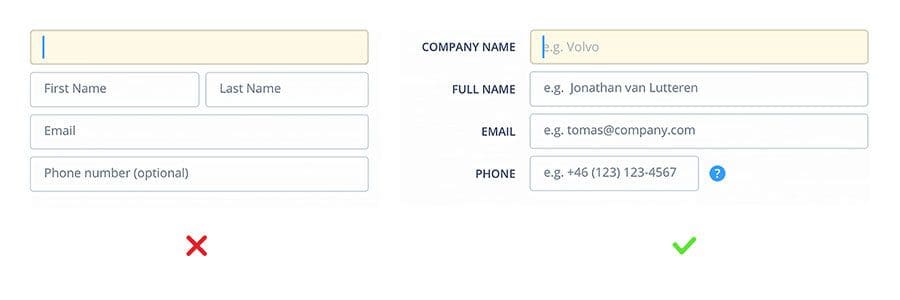
Form labels tell you what you need to write there. But some forms have labels inside the fields which isn’t ideal. They’ll disappear when you come to enter the information. It’s better to have your labels on the outside, and use placeholders on the inside. If there’s not enough space, minimise the labels in the top left corner of the field once it become active.
#4 Check for errors as you go
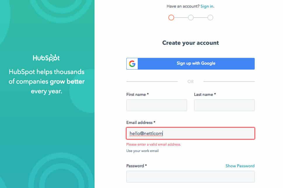
Even with clear labels people will often make mistakes. Validate the entries in realtime so they can fix it right away rather than saving it until they’ve hit submit. Don’t panic too early though! Only highlight the error once they’ve moved onto the next section, not while they’re entering information as this will trigger bogus errors that are rather premature.
#5 Acknowledge receipt
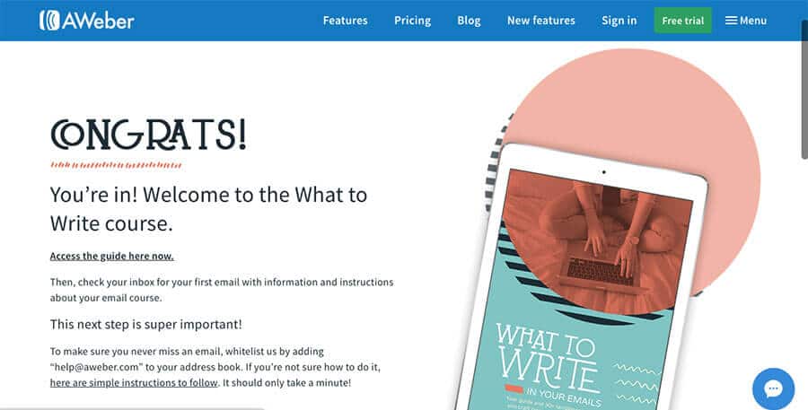
Be sure to give users a reassuring confirmation so they know their hard work hasn’t gone unnoticed. You’ll want to send an email of course, but some immediate on-screen notification is what’s needed. Say thank you and let them know what’s going to happen next. Suggest some other links (articles, products, social) that they might find interesting.
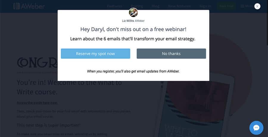
And as if that wasn’t enough, a new pop up with an urgent call-to-action catches your attention with the offer of a free webinar. For full marks, notice the little live chat icon on both of these pages, for the realtime leads: Those visitors ready to act or ask questions right now.
Colour It In is here to help you all the way and make sure your Forms work for YOU – Call now on 01765 570072 or Pop-in for a Chat.
WEB FORMS MIGHT BE BORING,
BUT CATCHING LEADS IS FUN.
approx 4 minute read
Hmmm, you’re right. Web forms are a bit boring. So boring in fact, that we weren’t sure whether we should even write about them.
But making more money is fun, right? Sparking more interest? Generating leads?
OK, good. Because here’s the thing. Despite over 65% of businesses saying that generating leads is really tough, over 70% don’t actually have a call to action on their website. Shock!
CALL TO ACTION, BATMAN
Sounds like a superhero’s inner calling. It’s not. A ‘call to action’ is an attempt to get the website user to do something rather than simply just browse and leave.
These websites are failing. Not pulling their weight. Because if your website isn’t into sales then it needs to be into lead generation.
HOW DO YOU CAPTURE LEADS?
Lead generation falls into two main categories. Let’s call them Real-time and Lifetime.
Real-time lead generation
Real-time leads are gathered immediately. People land on your website and immediately get in touch. This call to action could be by phone, live chat, pigeon.
That ‘in the moment’ stuff is HUGE for businesses right now. Especially when you consider mobile browsing which pulls in location and context (i.e. In your city and looking for a good restaurant right now). Pigeons are less useful in this situation so be sure to have actionable ‘call’ buttons and live chat available.
On mobile, users often prefer an option to call rather than fill out complicated forms on their mobile devices. So offering prominent click-to-call buttons can keep users from ditching the task altogether.
Lifetime lead generation
Lifetime lead generation is about gathering data via a form of some sort. 96% of your website visitors aren’t ready to buy yet.
You can’t nurture what you don’t have, so whether it’s a contact form or a sign-up form, it’s crucial to get this part right. Let’s look at some effective tips to make sure your web form is on top form.
#1 Keep it short
Short forms perform better. Common sense really. Long forms look boring and time consuming. The conversion rate drops with every extra field requested. So be efficient. If you do need to gather lots of information, consider splitting it up over a few pages (add a progress bar so people know where they are).
#2 Think of mobile users
Build features into the form that make them easier to complete on a phone. Stuff like automatically loading a numerical keypad helps when asking for info that includes numbers. If possible, automatically advance them to the next field as they enter the info. Saves them having to click into each of the little boxes.
#3 Use clear labels
Form labels tell you what you need to write there. But some forms have labels inside the fields which isn’t ideal. They’ll disappear when you come to enter the information. It’s better to have your labels on the outside, and use placeholders on the inside. If there’s not enough space, minimise the labels in the top left corner of the field once it become active.
#4 Check for errors as you go
Even with clear labels people will often make mistakes. Validate the entries in realtime so they can fix it right away rather than saving it until they’ve hit submit. Don’t panic too early though! Only highlight the error once they’ve moved onto the next section, not while they’re entering information as this will trigger bogus errors that are rather premature.
#5 Acknowledge receipt
Be sure to give users a reassuring confirmation so they know their hard work hasn’t gone unnoticed. You’ll want to send an email of course, but some immediate on-screen notification is what’s needed. Say thank you and let them know what’s going to happen next. Suggest some other links (articles, products, social) that they might find interesting.
And as if that wasn’t enough, a new pop up with an urgent call-to-action catches your attention with the offer of a free webinar. For full marks, notice the little live chat icon on both of these pages, for the realtime leads: Those visitors ready to act or ask questions right now.



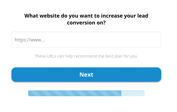 Short form with progress bar from leadformly.com